|
The Butterfly EffectDate: December, 2019
Size: 8 1/2 x 11 in Medium: Ink and watercolor on card stock Exhibition Text: For my last piece, I wanted to create something that reflected myself as much as possible, without the need of creating a self portait. Using the inspiration of Ursula Doughty and Kit Sunderland, I created a negative butterfly watercolor painting on sheet music. This piece is meant to represent me by every element included, the symbol of the butterfly for personal growth, the vibrant colors for good mood, and the background song to have the most personal touch to me, a song that I deeply associate with my overall character. I wanted to portray the concept and feeling of my character development over time through expressing who I am now and the comfort and confidence I now have in myself. |
Inspiration
Aside from artistic inspiration, the concept of the "butterfly effect" was my main inspiration, which is the theory of how one small event can later on have a large impact on something or someone. I applied this theory to the history of my personal life, as it allowed me to appreciate both the good and bad things that I have experienced and have a brighter outlook on life. Without those experiences, either dramatic or seemingly insignificant at the time, I would not have learned and be the person who I am today. I chose to display my current self with bright colors and my commonly used symbol of a butterfly. I chose a butterfly to symbolize myself because they symbolize growth as they transform throughout their lifetime.
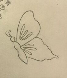
"Uknown" by Ursula Doughty
Originally being inspired by complex illustrations drawn on music sheets, I followed the path of creating a piece on sheet music. Realistic approaches were never my strong suit in my paintings, but illustrations would allow me to be more precise with my color choices and fine lines and I was willing to experiment with it. However, all of the inspiration I came across similar to this piece were only of cartoon characters and their corresponding theme songs. Although they looked very appealing and tempting, I wanted to create something that was meaningful to me, with both the image and the music sheet. Because of this, I furthered my research for another approach following the same concept.
|
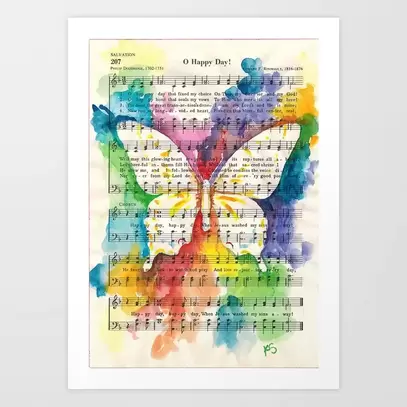
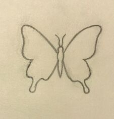
"O Happy Day Butterfly Watercolor on Sheet Music Art Print" by Kit Sunderland
With further research, I came across the work of Kit Sunderland, an artist who works with mainly watercolor. Immediately, it was her work with the butterflies on them, as the symbol of butterflies are personal to me in my own meaning and have been used in my past pieces. Also, the use of color in my inspiration is very similar to my use of color in my past pieces, so I strongly felt a relation to Sunderland's work. Since the overall mood of this piece is upbeat and freeflowing from the mix of the bright colors and the fluttering of the butterfly, I will choose a song that has an upbeat mood as well. The song will have a connection to me as a reflection of who I am and how I see myself, in terms of mood. This is a difference from the song in the background of my inspiration, as "O Happy Day" is a religious gospel song from the 1960's, possibly making the purpose of this piece spreading religion and the beauty and positivity that the artist may feel comes with it.
|
Planning Sketches
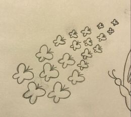
Straying away from the idea of one single butterfly in the center of the page, I outlined the first idea that came to mind. The concept of many butterflies flying away together and getting further away looked nice to me, but I could not find a meaning for it that could relate to me or this project, so I did not go through with this sketch. Also, I would have to keep in mind that I would be painting around the butterflies, and having many of them would be time consuming, difficult, and may not turn out as neat as I would like.
|
I went back to the idea of only one butterfly, but I still tried not to have the it in the center and laid out. I chose to sketch an outline of only one flying away, but not making the other wings visible as it may look disfigured in the painting. I did like how this outline looked more than the original sketch, however I still could not find a meaning for why it would be flying away if the topic was being comfortable with myself. Although I had to work on it, I still did not completely exclude it as a possibility.
|
Finally, I gave in to the idea of having the butterfly centered and layed out. I appreciated the sense of balance it brought to the piece and how it gives the sense of pride as it sits. That was my interpretation of it, and it was exactly what I wanted to convey in this project so I went with it. Although, I did want to change the outline of the butterfly as I did not want it looking too much like my inspiration, even though I would be using a different color distribution with the paint.
|
Process
|
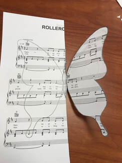
First, I printed multiple copies of the sheet music to have room for experimentation and planning sketches. I made sure to print the music on card stock instead of the usual printing paper, this way the watercolor would not make the paper flimsy and lessen the quality. I darkly drew half of the butterfly to my liking and cut out that half while connected to the rest of the paper, this way I could trace the wings to be symmetrical without using the time to draw them to look exactly the same. I would then place it on the paper and trace it to paint.
|
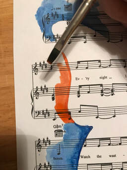
|
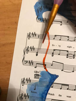
When beginning a new area of color, I would have to be careful near the edges of the stencil as I did not want sloppy edges. For this, I used the finest brush I had to outline it first with a lot of water and paint. By using a lot, I would be able to spread it outwards so that there would not be only one dark line of color on the outline.
|
|
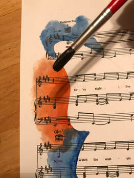
Once I did the outline with the fine brush, I then switched to a different brush. This one was wider to cover more room, but was fine enough to use near the edges. With this brush, I further spread the paint outwards and added more to blend the light and dark shades, so it would not be obvious where the fine line was.
|
|
Finally, I used the widest brush that was given with the watercolor pallet. Using this brush, I was able to spread the color further away from the stencil. It was also able to carry more water, making the colors lighter the further I painted away from the stencil. I tried to make each color reach outwards differently from the others, this way it would not look so neat and orderly for the colors.
|
|
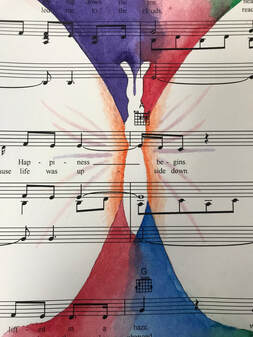
Once the background was completed, I focused on detailing the inside of the wings so that it wouldn't be plain white. I followed my inspiration and added an orange to outline the body. I also added new lines of lightly colored reds and purples to extend further into the wings.
|
Experimentation
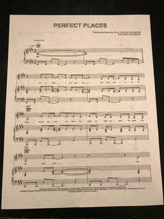
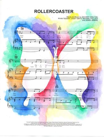
When printing the song for the background, the printer wouldn't print the music as boldly as I wanted to so I had to play with the settings to take it off of ink saving mode. The song "Perfect Places" by Lorde is meaningful to me as it is an upbeat song in an album that is dedicated to self growth, awareness, and love. This song is purposely placed as the last song in the album "Melodrama" as it represents not only the self accepting but the embracing of one's self and feeling comfortable and confident. This song means a lot to me as I can relate to it and it often helps me, however once I printed the song I realized that I had another song in mind. I was reminded of "Rollercoaster" by the Jonas Brothers, which has a similar meaning to it. The concept of overcoming obstacles in life but ending up ok and enjoying life is expressed as well, however I feel that the sound of the song reflects me more. It incorporates a more mellow and dramatic sound as a form of reflecting on the past which later turns into the upbeat sound. I appreciate how the concept of reflecting on life is incorporated into this song, as it is an element that "Perfect Places" lacks. I also very much appreciate how the lyrics on the music sheet say "Happiness begins" and "We found better days" as it specifically contributes to the topic. The album this song is from, "Happiness Begins", is largely focused on revisiting the hardships of the past and learning to grow from them. With both songs in mind, I was VERY conflicted as to which song fit me and the topic of this project the best.
|
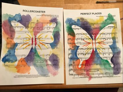
My first experimental print did not go well. I did like the colors and their lightness, however I felt that I had made the sections too small and orderly. I felt that I did not blend them enough together, and the outline of the entire stencil was poor. For this trial, I did not use the method of using the different brushes, I only used the widest brush. Also, I did my first draft of how I would fill in the butterfly's wings, and I did not like it. I felt they were too stiff of lines and too noticeable and thick. I changed my methods with my next trial. Running out of prints, I had used a print from the song I had originally chosen. I now applied the method of using the finer brushes and larger areas of the colors, and I like the way it turned out and I will be continuing this method for the final product. I did like the lightness of the colors in the first piece, but the method of being more careful with the painting lead to darker colors, and I like that better because it contrasts the whiteness of the butterfly. I also feel I did much better on the inside of the butterfly as the lines are thinner and more organized, however I still would like to achieve even more subtle lines. Also, by using the sheet music from y old song, I realized just how light the printing of the new song was. The thicker, bolder printing of "Perfect Places" looked much better than the lightness of "Rollercoaster", as I can see easily that it is sheet music. Of course, I would need to look into a solution for the lightness as I want the sheet music to be bold and obvious behind the business of the colors.
|
Reflection
Overall, I am somewhat pleased with this piece. I do think it is nice looking and I appreciate the meaning behind it, however it does not look as nice as my inspiration. It was much more difficult than I had anticipated causing me to be more careful and later on causing the colors to be darker, which I am glad I discovered. The most difficult thing that I encountered throughout this process was the filling in of the wings with the light colors. I wanted it to have some color, but not enough to seem extremely noticeable. I also was not sure how to place it as I could not follow my inspiration because they are differently shaped. I do think that in the future I will continue to work on this piece until I am satisfied with it. The meaning behind it just as beautiful to me as the look of it, and I want to make sure it is presented as best as possible. I do also see myself purchasing a white picture frame for this piece as it would help with the display and overall look. I don't, however, have a meaning for framing it as I only think it would benefit the piece for looks. What I would change in the future about this piece is making the inside curved lines darker or finding another way to upload the finished photo of it, as the current scanned photo of the piece does not show the light purples and pinks within the wings very well. Also, the colors of the background are darker and bolder in person than in the finished scanned photo.
