|
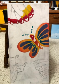
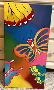
MigrationSize: 2ft x 1ft
Medium: Acrylic on canvas Date: October 2019 Exhibition Text: I created this painting as I wanted it to capture the beauty of the many people around me changing and soon parting ways. As a senior in high school, I've spent the past four years with those around me as we've all seen each other change. Now this upcoming May, I'll be separated from these people and possibly never see them again. It's a bittersweet thing and I wanted to convey that in my piece, following the inspiration of Marcia Baldwin. |
Inspiration
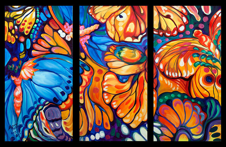
"Abstract Butterflies Triptych" by Marcia Baldwin (2013)
|
From the beginning, I knew I wanted to make something very colorful and meaningful. I've already made previous pieces with the symbol of butterflies, but I was especially excited for this one as I haven't done a painting with these vibrant of colors yet. Marcia Baldwin's work has caught my attention before, but I have never been able to incorporate them into mine. Specifically the third panel of this piece caught my attention as you can see the majority of a butterfly and understand what it is, while also seeing the shape of others. I wanted to incorporate this into my piece as I want it to be obvious that there are many subjects in the painting and that it is not only about one specific person or thing. I also want to make sure that they are all going different directions and apply a sense of depth through larger and smaller butterflies to emphasize the concept of students going their own ways.
|
"Butterfly Abstract" by Marcia Baldwin (2006)
|
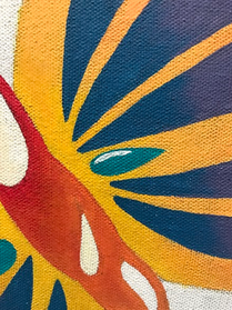
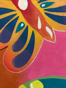
Very similar to my first piece of inspiration, I followed the flowing style of the butterflies in this piece. I specifically followed the outline of the butterfly on the bottom right. However, the reason that I did not follow this one the most is because it looks more realistic, which I did not want. It also has nearly every space filled with the wings of a butterfly which I also avoided to stray away from the busy visual. It seems almost more of a crazed tightness rather than the spaced out freedom that I wanted to convey.
|
Planning Sketches
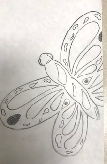
For the first and main butterfly, I wanted to make sure it would take up the most space by including the majority of its body. I wanted a variation of patterns and styles, such as larger fluid shapes and smaller strict shapes. I wanted a very fluid looking style such as Baldwin, and I would do that by including bending lines and a variation of curves and sharp edges. For the original sketch, I did not want to include antenna as I thought they would look too childish, however I found a technique that included messier dots that would create the shape and keep the fluid look at the same time.
|
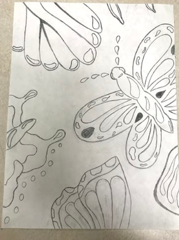
For the finalized planning sketch, I made sure to evenly distribute the shapes across the paper, drawing each wing to seem as if they were flying in different directions. I also gave each one its own style and colors so that none are repeated. Most importantly, I based each butterfly off of a different species, so that it was obvious that there is a variety of butterflies and people for my meaning, none of which being the same. I also did this to not make the visual boring or overwhelming of the same image.
|
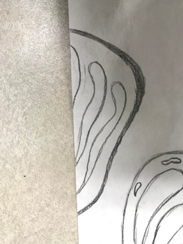
As I finished up the planning sketches, I had to consider the change in dimensions from the paper to the canvas, as the canvas is longer than it is wide. I left open spaces between the butterflies to leave room for squishing them closer together, however I also included "space holders" such as the shape above. I did not necessarily create it to be the wing of a butterfly as I thought that would make the piece look too busy and cramped, so I made it to be a more simple shape that still fit the style of the rest of the painting. If there is room for the "space holders" when I transfer the image, I will include them.
|
Process
|
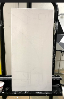
Because I had drawn on the canvas for a previous idea for a project, I had to get rid of the outlines. Rather than struggling to erase them, I simply painted over them with a layer of white paint so I would be able to transfer the image and see clearly the lines that I was meant to follow.
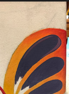
To make the process easier for myself and more manageable, I worked on one butterfly at a time, starting with the main one. I began with the most obvious colors that took up the majority of the butterflies and the space, such as the oranges. To give the painting a sense of depth, I added different shades of each color and painted them where I saw best fit. I then further shaded the wings and added more color to them to make them not seem as if they were only flat shapes.
Starting on the next wing, I learned that it is easier and less time consuming to start with the darkest color when blending, so I began with the red tips. I worked my way up with lighter colors and blended, however I did not want this wing to be as carefully blended as the others to have its own style, and I left it obvious as to where each color started. I also further emphasized this by outlining the wing in thin black lines.
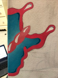
I then began with the bottom butterfly, and I wanted this one to be a beautiful and vibrant blue, so I had to make multiple shades of bright blue. I also added darker lines and colored in the center body a different shade of pink.
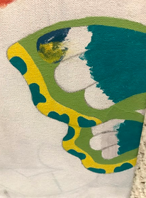
I finally started the last butterfly, careful not to reuse all of the same colors from other butterflies. Since this once had many little spots, I colored those in with the most vibrant color of that butterfly for emphasis.
Once I felt I had completed the entirety of the butterflies, I returned to working on the background of the piece and shading it in by the section. I had to be careful with this part of the process as not every section of the background is the same color and has the same shading.
|