|
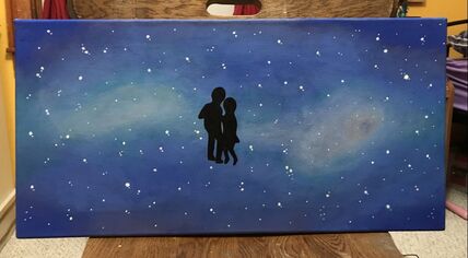
WaltzDate: November, 2019
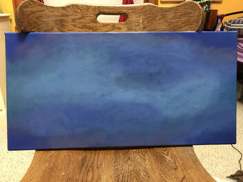
Size: 2 ft x 1 ft Medium: Acrylic on canvas Exhibition Text: The purpose of this painting is meant to express love and the grace and elegance that comes with it. Although romance is not a topic that I cover normally throughout my pieces, I do have the theme of relationships between people, and this, in my opinion, is one of the strongest relationships you can have with someone. Mainly following the inspiration of a shot from La La Land's Planetarium scene, I incorporated the techniques of Olga Shvartsur's galaxy painting, I created a piece capturing the feeling of getting lost in space with the person you love. |
Inspiration
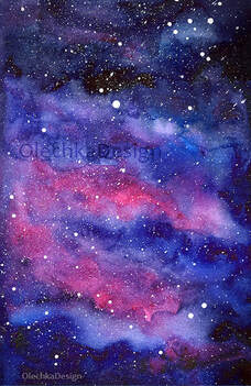
Nebula Galaxy Watercolor Space Sky Art Print
by Olga Shvartsur Trying to find an artist's inspiration was very difficult for me as I wanted to create a galaxy but as a painting. I knew from the beginning that that was going to be a challenge, especially for acrylic paint, but I finally found an artist that I can work off of, even though the medium is of watercolor. It was also difficult to find a plain galaxy painting as Olechka creates a lot of paintings that involve animals and rainbows when I just wanted a simple image. I do, however, need to remember to make the space effect less dramatic with the bold and bright colors as it will be too distracting for the contrast of the people dancing in the middle. I especially have to make sure to make the background more subtle than Olechka's as I do not want to make it seem childish or ordinary, as well as having a more structured background as an oval for the brighter colors and the stars.
|
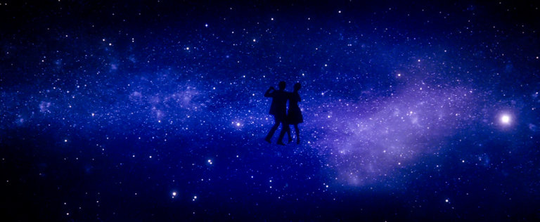
La La Land Planetarium Scene
In the Planetarium scene of this movie, the two characters waltz as dramatic orchestral music plays. This has been one my favorite scenes for years as it expresses such a beautiful form of love without the use of words and only through the expression of music and dance. My interpretation of this scene was the elegance of romance being communicated through the waltzing dance. This dance is very smooth moving and free flowing and it interprets to the easy and natural feelings that come with a good relationship. As for the background, my interpretation was that while the two in a relationship are in an intimate moment such as that of dancing, what surrounds them doesn't matter, as if they get lost in space together and continue on with their priorities of each other. I wanted to convey this exactly through my own medium of painting and the techniques of Shvartsur in the background. I wanted to follow the subtle blues and dark purples of this galaxy background to make the silhouettes pop out more. Most importantly, I appreciated the concept of having the couple as silhouettes to convey the simplicity of the concept of love on the surface, but the complexity of the feelings that surround it, conveyed through the vast size of space and the beautiful colors and detail that go into it. I also decided to paint with the canvas landscape to mimic the horizontal screen of the movie.
|
Planning Sketches
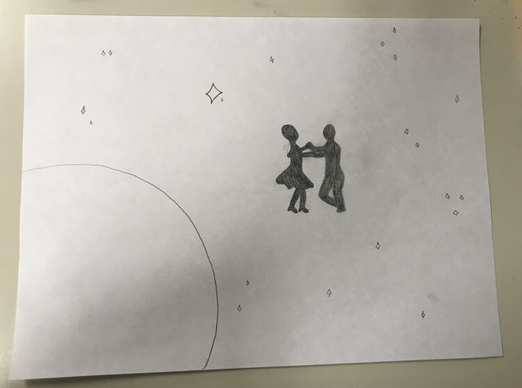
Keeping my main idea, I played with the idea of the shapes of the stars being diamonds and often being grouped together throughout the canvas in twos or threes, this way I would not have to paint the entire background with small and tedious stars. Also, I planned on painting a planet to further enhance the space concept in one of the corners, however I felt that would throw the painting off in the sense of balance and symmetry, so I did not include the planet.
|
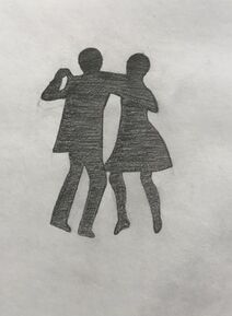
I also played with the positons of the silhouettes by following other positions of the dance throughout the scene. I chose between these two, and I wanted to choose the one that gave the most impression of movement from the dance. This movement would come from the position of their arms holding each other and the bending of their knees, as well as the flowing of the woman's dress.
|
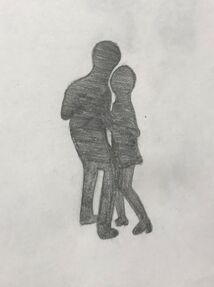
I created this planning sketch pretty last second as an idea had come to me immediately before I outlined the silhouettes on the canvas. Rather than recreating the silhouettes from the movie, I realized that since this is a painting personal to me, I should search for an image that related to this topic and was also personal to me. I searched through my camera role and found a perfect photo that I was able to create the silhouette from. I was especially excited for this part because I now made it even more personal to me.
|
Process
|
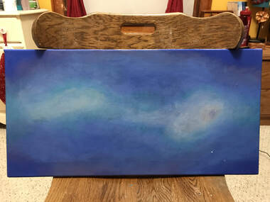
Firstly, I added the basic background colors of the galaxy, such as the dark blues and purples around the corners and the center. I made sure to start with the darkest colors in the corners as I have learned that it is easier to blend colors into the darker ones first. To make a galayxy that looked decent, and especially since this was my first time creating something so complex, I knew I would be painting and repainting layers throughout this entire process.
|
|
Secondly, I added many more shades of blues and purples, starting with the darkest ones first. I made sure for the edges and corners to remain the darkest with the middle of the painting the lightest. This part of the process was possibly the most difficult as I had to blend and reblend the colors to make sure there were no uneven spots and that they were blended evenly. I also made sure not to color the corners and edges a dark blue or black like in my inspiration, as I knew I would later paint in the silhouettes black and I wanted them to strongly contrast the bright colors of the background.
|
|
One of the most crucial parts of the process was the completion of the background colors. To make the lighter areas an even lighter shade, I used a pearl white rather than my regular white. This way, it gives the painting a brighter emphasis without the obnoxiousness of the brightest white against the blues. Also, I added an aqua color on the outside surroundings to add another vibrant colorto the piece, such as the vibrant purple in both of my inspiration pieces. However, I wanted to incorporate the lighter shades of green instead. It also further emphasizes the white areas.
|
|
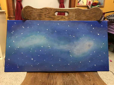
One of the easiest parts of this process was the implementing of the stars as I only had to use the tips of my finest brushes. I had to be careful though, as I di not want to cluster too many stars together as it would be almost impossible to cover them up again because the background is almost entirely blended rather than one solid color. Although I did try to have a similar realistic effect from the La La Land frame, I did have to follow the piece of Shvartsur with the large and small dots in paint.
|

|
Finally, I outlined the shapes of the silhouettes. Although they do look similar to the figures of my inspiration, I am glad I took the step to use my own figures and that it paid off. I also used the finest brushes that I had to fill in these figures as covering up any mistakes would be difficult, especially for the lighter colors in contrast to the black. Before making any mark on the canvas, however, I made sure to measure so that they would be centered. And although I did not try, I found it interesting that I had created balance and symmetry in this piece by having an area of white on each side of the dancers.
|
Experimentation
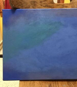
While creating the background colors, I experimented with including the aqua color earlier in the process rather than only for the outlining of the white areas. However, I did not like how the aqua was blending with the blues and the purples, so I painted over it with the remaining blues. By doing this, I would have had a stronger contrast in color with both of my inspiration pieces as they are both inclusive of purple very heavily.
|
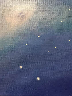
Since I did want a more realistic approach for these stars rather than just dots such as Shvarstur's, I went over every larger star with a rough outline of the same white. This way, they do not seem to 2-dimensional and have a sense of depth, which I appreciated and found very helpful with the look of the piece.
|
