
|
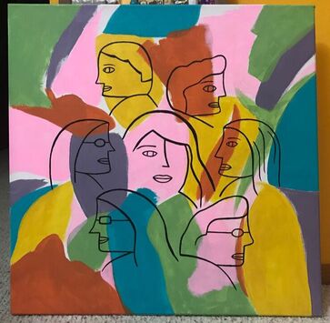
FriendsSize: 2ft x 2ft
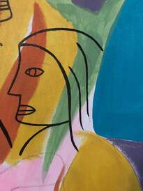
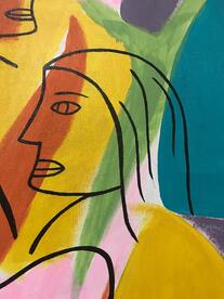
Medium: Acrylic on canvas Date: June 2019 Exhibition Text: This painting was meant to represent the importance of friendship to me and how empowering it can feel. Following the artistic inspiration of Leon Zernitsky, I represented a small group of people that I consider close friends of mine and how I take comfort in knowing that they are there. I am represented in the middle and although I am representing specific people through the concept of this painting, I did not create the surrounding faces based on any specific person. The many colors used in the background represent the diversity of different backgrounds between me and my friends that I appreciate. |
Inspiration
|
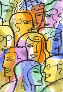
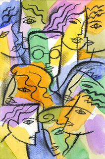
Following the concepts of friendship and researching artists that have covered the same theme, I came across Leon Zernitsky, a conceptual artist who specializes in simplistic designs and figures. What caught my attention the most was his use of light colors in the background and the use of a single color for the faces. The contrast between the two is something I appreciated in these pieces and is something I wanted to be sure to recreate in my piece. I also favored the left piece over the right side piece due to the face that the center face is facing forwards. It catches the attention of the viewer and communicates the point of that face being the main focus. I recreated this in my piece, while having all others facing sideways. I also followed the many different ways to create facial features and hair. However, the main difference between my piece and my inspiration is the use of materials. Zernitsky created his pieces with the use of watercolor background and graphite faces, while my painting is entirely acrylic. I also did not want the faces to take up the entire canvas as I wanted it to be focused more on a specific and smaller group of people.
|
Planning Sketches

The first planning sketch involved the concept of the surrounding faces, specifically the ones that did not wear glasses. I was playing with the thought of only the center face having filled in eyes while the others did not. However, that gave the painting a kind of creepy mood that I did not want to represent. Also, I realized that I had to be careful while shaping the mouths of every face, as making one smile too much or frown too much could make the message confusing.
|
I had a lot of ideas for the center face and found myself always going back to change a certain aspect of it, but the main dilemma of mine was whether or not include a second eye. There would definitely be space for it on the face and it would be another difference from the surrounding faces, however the use of only one eye is something that I admired from Zernitsky's pieces. Having the ability to place the eye there but choosing not to adds to the simplistic idea and style that this painting has.
|

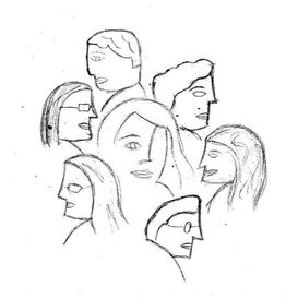
The final planning sketch is the one I ended up going through with the most, as I felt it was closest to Zernitsky's style and closest to my message, while looking the most visually appealing of all the different options. It includes the simple, yet different and distinct features of the different faces and faces them only sideways to emphasize the center face. However, I later decided to add more room onto the center face for a second eye by subtracting space from the nose, even if I wasn't going to add it.
|
Process
|
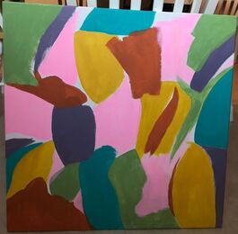
The first step in the process was to create the different layers of background in the piece. For these steps I mainly followed my inspiration, but not completely. The first color that caught my attention was the yellow, so I painted some areas on the canvas yellow with loosely structured shapes.
The next steps included adding the additional layers of different colors. I made sure to not run out of paint for any color as I would want to make changes with the sizes or shapes in the future. I also made sure that each color would have a mix of large and small sizes and would be placed away from any other spot of the same color.
The final touches of the background included filling the majority of the canvas and leaving very small spaces painted white. I also made sure to overlap some areas with different colors to show the lack of complete neatness in this piece.
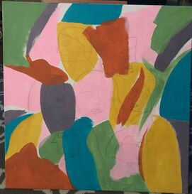
The next stage was to draw the outline of the painting onto the canvas. This stage took the longest time and was the most challenging as I had to proportion everything and place into the right location on the canvas. I also had to make sure that none of the surrounding faces were larger in size than the center face.
The final step in the process was to trace the outline with black paint. This step was also challenging as I had to be careful while outlining because I no longer had the paint for the background, and I would be unable to paint over any mistake I would have made. Luckily, I made no mistakes and was careful while painting with a thin paintbrush.
|
Experimentation
|
|
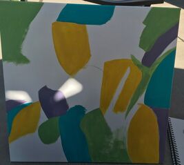
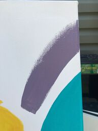
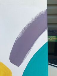
Early in the process I had experimented with different colors for the background. Since I would not be using watercolors such as my inspiration, I would have to use very light colors in order to have the same lighthearted feeling that Zernitsky's pieces gave off. Many of my first colors had come off too dark for my liking, so I had to experiment with different shades until I finally reached a color that I liked. I especially had to experiment with the purple paint since it was the darkest color used for this piece.
|
|
During the final stage of the process, I experimented with the look of the face on the right hand side of the painting. Since this figure's hair would be cutting through the blue section, I experimented with the look of it cutting off before. If I did that for this figure and some of the others, it would give the sense of the front figures working together with the background, rather than just being painted over. However, I did not like this idea more than painting over, and I stuck with the original plan.
Reflection
Overall, I am somewhat pleased with this piece. I appreciate its concept and I like the way that I chose to convey my subject, however I wish I had done it differently in minor ways. I would like to recreate this piece actually following the materials that Zernitsky had used, with watercolor for the background as it created more of a transparent and lighter effect in contrast to the black paint I would have used for the faces. It would give the faces the effect of popping out more and would emphasize their overlap in color. I feel I did not have that effect as I used all acrylics which resulted in very bold colors for the background, along with thinner lines for the faces in the front. they do not stand out as much as they could have, especially since they do not take up the entire space on the canvas, but I am comfortable with the amount of space that they take up. I do, however, appreciate my ability to convey the subject of my appreciation for friends and the very different backgrounds that we come from. Having friends that I can trust is very important to me and I feel I am finally comfortable with that area in my life and it was important for me to communicate that through my work. I specifically made the decision to not create the faces based on certain individuals as I did not want to narrow down the important friends in my life, and instead conveyed them all in general.
ACT Responses
Clearly explain how you are able to identify the cause-effect relationships between your inspiration and its effect upon your artwork:
I wanted to portray the same concept as Leon Zernitsky and I feel he did so perfectly, communicating the appreciation and importance of friendship without including the typical images of two or three friends that are very commonly seen.
What is the overall approach (pov) the author (from research) has regarding the topic of your inspiration?
The information on both pieces were unbiased and stated only facts about the physical piece itself with only little background information.
What kind of generalizations and conclusions have you discovered about people, ideas, cultures, etc. while you researched your inspiration?
I came to the conclusion that Leon Zernitsky had felt the same kind of appreciation and gratitude that I had while searching for the inspiration to make this piece. In order to create a piece that communicated the importance and beauty of something, it is most likely that he had shared that feeling as well.
What was the central idea or theme around your inspirational research?
The central idea around my inspiration was expressing appreciation to close friends in a simple, yet meaningful way.
What kind of inferences did you make while reading your research?
Inferences I made included Zernitsky having many different ways and visions to express the same concept and meaning as he has multiple pieces under the name "Friendship" that have the same styles yet different looks and techniques.
Bibliography
“Friendship Drawing.” Saatchi Art, www.saatchiart.com/art/Drawing-Friendship/694924/3884380/view.
Laird, Harold Martin, et al.
“Friendship by Leon Zernitsky.” Pixels, pixels.com/featured/friendship-leon-zernitsky.html.
Laird, Harold Martin, et al.
“Friendship by Leon Zernitsky.” Pixels, pixels.com/featured/friendship-leon-zernitsky.html.
