|
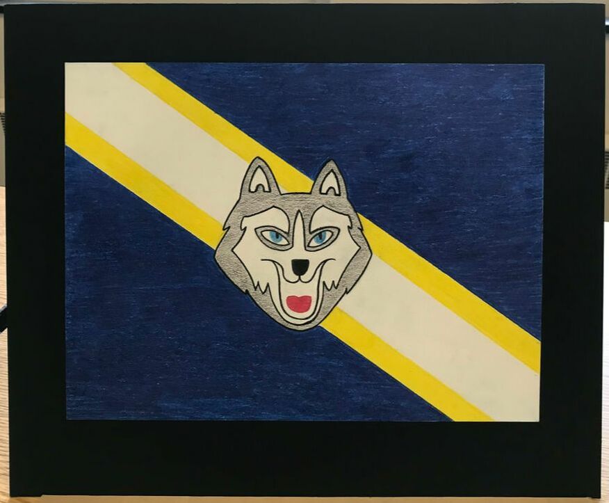
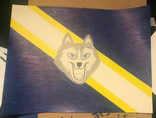
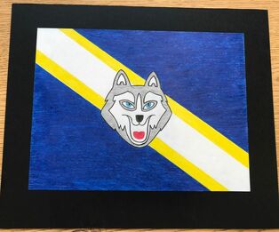
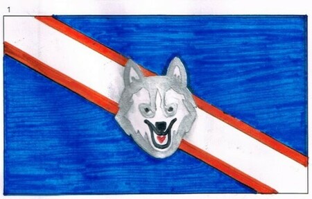
Reagan High School FlagSize: 12.5 by 15 in
Medium: Colored pencil on paper Date: April 2019 Exhibition Text: I created this piece to represent the school of Ronald Reagan. The center husky represents the mascot of the school, the majority blue representing the school's colors, the yellow for MPS and the center white strip for IB, being the basis of Reagan and what makes it different than other MPS high schools. |
Inspiration
|
|
|
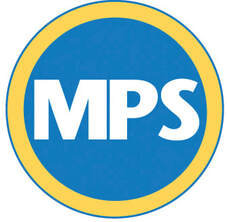
Milwaukee Public Schools logo
|
International Baccalaureate logo
|
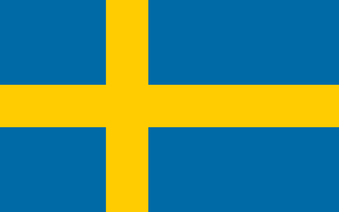
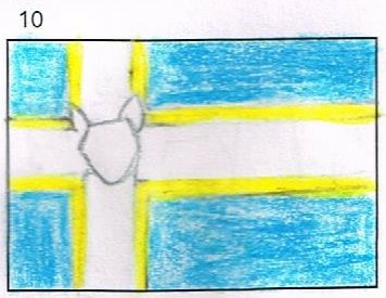
The flag of Sweden
Although the flag of Sweden incorporates the same main colors as my examples, I chose this flag due to its design. The Nordic Cross design for Sweden symbolizes Christianity, as it is their main religion. The yellow and the blue are inspired by the coat of arms of Sweden, which includes the shields of sky blue centered with three yellow crowns. I chose this design for my piece as the cross, rather than representing religion, is the main structure of the flag that keeps its together. This strong structure could represent, to Reagan, MPS and how we represent the district first and above anything else. The cross also reminded me of MPS as one of their main colors is an identical orange.
|
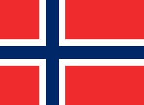
The flag of Norway
This flag especially caught my attention because not only does it have the intersected structure that I wanted, but it incorporated two colors within that design. The colors of this flag coincide with the colors of the French and may share the same desire for independence, as they did not have independence until 872 AD. The white represents the Scandinavian cross representing the Danish flag, and the blue cross representing Sweden. I chose this flag as inspiration because the white outline of the Scandinavian cross reminded me of our limits and expectations of IB. We are an MPS school first, however we are different in terms of being an IB school, and I felt that is something needed to be recognized in my piece.
|
Process
|
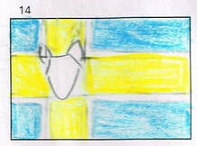
The first step in the process was to color the flag's design onto a sheet of paper using color pencils. The designs were created to have straight lines for the stripes measured to the same width for its corresponding stripe. Following some critique given, I increased the size of the husky head from my previous planning sketches.
I then outlined the husky in black to emphasize it and catch the viewers attention. This part of the process was unplanned, as the husky from the previous photo was intended to be the finalized coloring, however it did not stand out the way I had intended it to so I outlined the husky in black and added color to the tongue.
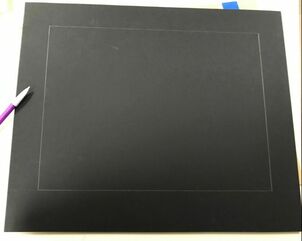
Once the flag was colored, the next step was to cut the board in order to prepare for mounting it. The measurements for the sides needed were 2 inches for the bottom and 1.5 for the remaining sides. This allowed me to only cut one side with a cork back ruler and an X-acto knife. The cork back ruler was crucial to this process as it prevented the ruler and the X-acto knife from slipping. The cuts across the single line on the board would need to be repeated until the board cut nicely on its own.
|
|
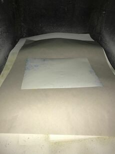
Once the board preparation was completed, the paper was ready to be glued. The paper could only be glued in a certain area underneath a fan due to the strong adhesive spray, which was placed in a small box underneath the fan. Once the fan was on, one quick layer of the spray would need to be added to the backside of the flag. It would then be needed to be carefully picked up in order to not get any adhesive spray on the front side of the flag.
Once the spraying process is complete, it needs to be carefully placed onto the tracings of the black board. If the paper is placed in the wrong spot, it may be difficult to peel it back off without ripping the paper, so it must be handled carefully. It works most efficiently to begin placing the paper on the line of the top of the sheet and lay the remaining sheet after. Carefully remove any air bubbles between the paper and the board.
|
Planning Sketches
As I started this project, I immediately knew that the royal blue and white which identifies Reagan would have to be incorporated into the flag. However, I also knew that I wanted more colors to the flag. After conducting research, I noticed that one of the main colors of the MPS logo is a yellow-orange, and I decided to include that color in order to represent the district. I also payed attention to the importance of IB in our school and how it makes us unique. I've decided to include white to represent the colors IB rather than Reagan.
|
|
|
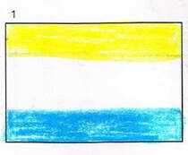
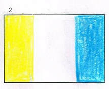
For the first sketches, I chose to focus on the color of IB primarily because it is what makes Reagan unique in MPS. All courses and expectations in Reagan are focused around those traits and curriculum of IB. However, I decided to include the yellow for MPS towards the top of each sketch, as MPS is the district in which holds the school. Towards the bottom or the right, I included the blue of Reagan. I chose these orders in order to follow the order in which Reagan falls in with the district and IB.
|
|
|
|
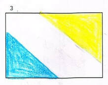
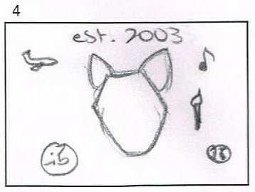
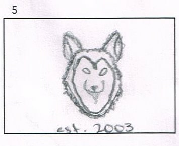
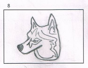
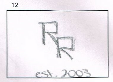
For my next sketches, I decided to experiment with symbols rather than colors. I focused on the husky mascot logo, first with the signature side profile of the husky, however I decided that the front profile of the husky is more recognizable as a husky and appealing. I also experimented with symbols that may represent the many programs and strengths that Reagan carries, such as the International Travel Programme, the Art and Music programs, sports and, of course; IB. However, I found that sketch to seem very childlike and difficult to recognize the many small factors from a distance, so I discarded that sketch. Lastly, I created the sketch of a possible logo for the Reagan name, itself, by incorporating the two capital R's sitting diagonal from each other. I also included the establishment year. However, I realized that I had only thought of that idea through the inspiration of Rufus King's logo with the initials RK, and I discarded that one as well. All sketches above will include the royal blue background and the white or silver linings.
|
|
|
|
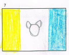
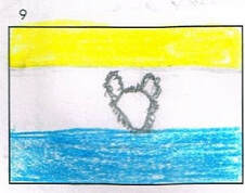
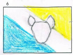
My next sketches included the front view of the husky mascot, since I find it more appealing than the front view, however I am still open to working with one or the other. I experimented with the placement of the husky in both size and according to the background. For the vertical and horizontal stripes, the husky would be approximately in the center and only within the white lines of IB. However, in the diagonal stripes the husky would be overlapping each of the stripes to be more attention grabbing than the diagonals. For the final sketch, I experimented by removing the portioned corner with yellow for MPS and turned it blue. I then relocated the color to the outsides of the white IB line to represent the significance of IB in an MPS school.
|
|
|
|
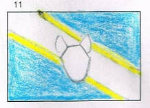
I believe my final sketches turned out the most successful. Following the inspiration from the Swedish and Norwegian flags, I incorporated the MPS, IB and Reagan colors and placed them in the same intersected format. For the first two, I placed the husky in the center of the intersection to create a sense of movement in order to move the viewer's eyes towards the husky from each direction. I also included sketches that did not include a husky at all, but only the signature colors for simplicity. I sketched the appearance of the flags if the white and yellow colors had been switched, and I very much like the simplicity and appearance of these flags.
Experimentation
|
|
I concluded with the sketches of the diagonal designs as they are the most meaningful and the most appealing. Also, because there are many countries with the designs of the diagonal lines, the flags do not resemble a specific country that may confuse the viewers as a representation of that country, as it did with the Scandinavian flags. This flag is my primary choice as it seems more appealing than the flag with the colors split in half. I also made the decision to use the color orange rather than yellow because it represents the MPS logo colors better than yellow. I also decided to use a darker blue as it better represents Reagan than a bright sky blue.
After researching animated front views of huskies and researching the term "husky vector", I concluded with the simplistic design of the husky. The center husky, although seen as blue throughout the logos of the school, I decided to use the colors of white and silver. This way, the blues will not be difficult to distinguish from one another and they husky is easily seen and well represented. I knew that I wanted the nose to be black, however I experimented with outlining the mouth with the color back, as well. In the final product, the lines of the mouth will be used with finer lines in order to not appear so bold. I knew initially that I wanted the husky to have its mouth open. This gives the mascot a look and sense of fierceness as it seems it is growling at the viewers. This gives Reagan the representation that it is a strong school that takes pride in itself and its achievements. The only "exotic" color that I used was pink for the tongue in order to further ensure the viewers that the husky has its mouth open. Other than that, I wanted to use as minimum amount of colors and complex designs as possible for the viewers to easily be able to recreate the flag on their own.
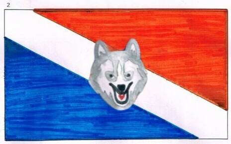
Using Photoshop, I pasted the sketch of the husky onto the second sketch, keeping the style and size the same. The only differences between the two flag designs are the backgrounds.
After researching animated front views of huskies and researching the term "husky vector", I concluded with the simplistic design of the husky. The center husky, although seen as blue throughout the logos of the school, I decided to use the colors of white and silver. This way, the blues will not be difficult to distinguish from one another and they husky is easily seen and well represented. I knew that I wanted the nose to be black, however I experimented with outlining the mouth with the color back, as well. In the final product, the lines of the mouth will be used with finer lines in order to not appear so bold. I knew initially that I wanted the husky to have its mouth open. This gives the mascot a look and sense of fierceness as it seems it is growling at the viewers. This gives Reagan the representation that it is a strong school that takes pride in itself and its achievements. The only "exotic" color that I used was pink for the tongue in order to further ensure the viewers that the husky has its mouth open. Other than that, I wanted to use as minimum amount of colors and complex designs as possible for the viewers to easily be able to recreate the flag on their own.
Using Photoshop, I pasted the sketch of the husky onto the second sketch, keeping the style and size the same. The only differences between the two flag designs are the backgrounds.
Reflection
Although difficult at first, this was one of my favorite projects of the year. I was able to create something to represent the school that I feel so positively about, and I was also able to do it in a simple way. In the very beginning, I struggled with finding inspiration and a visually appealing design. I also had to consider the factors of seeing the flag from a distance and from a a lower perspective, also from a backwards perspective. However, once I researched a complete list of countries flags, I began to create ideas that could be recognized as their inspirations. After receiving the critique that my designs may be too close to their inspiration, such as the Scandinavian flag, I decided to go with the flags that had a unique style to them without being recognizable as another country. I then built off of that idea and added more Reagan characteristics to it. When the finalizing process came, I was first intimidated with the idea of creating it with colored pencils. My past experience with the colored pencils have not been good enough for me to feel confident in completing the final piece, however I was able to learn how to properly manipulate the techniques of the pencil in order to get the clean coloring that I needed. In conclusion, I am very pleased with how this project turned out and I am looking forward to submitting it to the Reagan flag contest as I believe I did a good job at representing the school and its prides.
ACT Responses
Clearly explain how you are able to identify the cause-effect relationships between your inspiration and its effect upon your artwork:
The inspiration that I chose to work with inspired my flag specifically with the colors and the stripes. Using logos for inspiration, I restrained from recreating those logos and incorporated their signature colors instead. I also followed diagonal stripes as inspiration as they are more visually appealing while they can also portray the meanings that I want them to.
What is the overall approach (pov) the author (from research) has regarding the topic of your inspiration?
Each article read for research approached the subject with a unbiased perspective and stated only facts.
What kind of generalizations and conclusions have you discovered about people, ideas, cultures, etc. while you researched your inspiration?
Generalizations I discovered included the countries being in specific alliances with others, influencing the styles of their flags with their stripes.
What was the central idea or theme around your inspirational research?
The central theme around my inspiration was the main backbone of Reagan high school; IB and MPS.
What kind of inferences did you make while reading your research?
Inferences I made included certain countries using their personal history to inspire the design of their flag.
Bibliography
Krmela, David. “Sweden | Flags of Countries.” Sweden | Flags of Countries, flagpedia.net/sweden.
Krmela, David. “Norway | Flags of Countries.” Norway | Flags of Countries, flagpedia.net/norway.
“Branding Guidelines.” MPS, mps.milwaukee.k12.wi.us/en/Community/News--Resources/Branding-Guidelines.htm.
Iborganization. “Logos and Programme Models.” International Baccalaureate®, www.ibo.org/digital-toolkit/logos-and-programme-models/.
